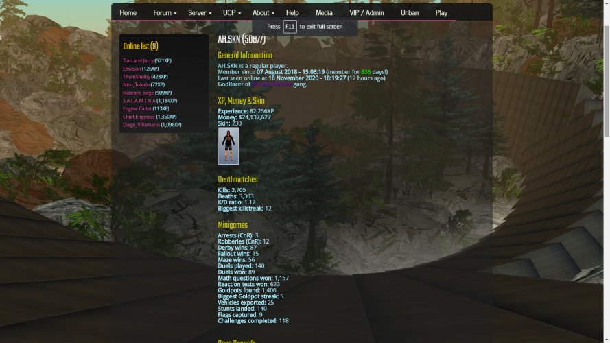
One of the biggest issues that lets any website down is redundant text. Text is ugly, people are lazy and don't want to read it. It should be kept to a minimum. I feel there are improvements to be made on that side of things, for example:

We shouldn't need to dedicate two lines just to say races participated in, won/second/third. There should also be more padding / line breaks between that information and "holding race records in races" (also has redundant text).
Same here:

And here:

Also, accessibility standards generally discourage the use of bold text. We have a fair bit of bold text going on and it doesn't look great.
There are a number of consistency issues too, for example:
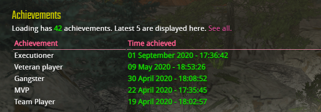
With achievements, we advertise and show the last 5:

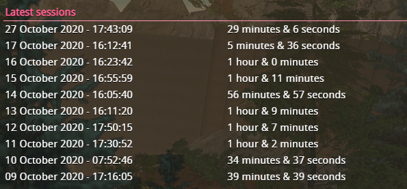
But for Latest Sessions, that number has doubled, taking up a lot of extra space with no good reason:

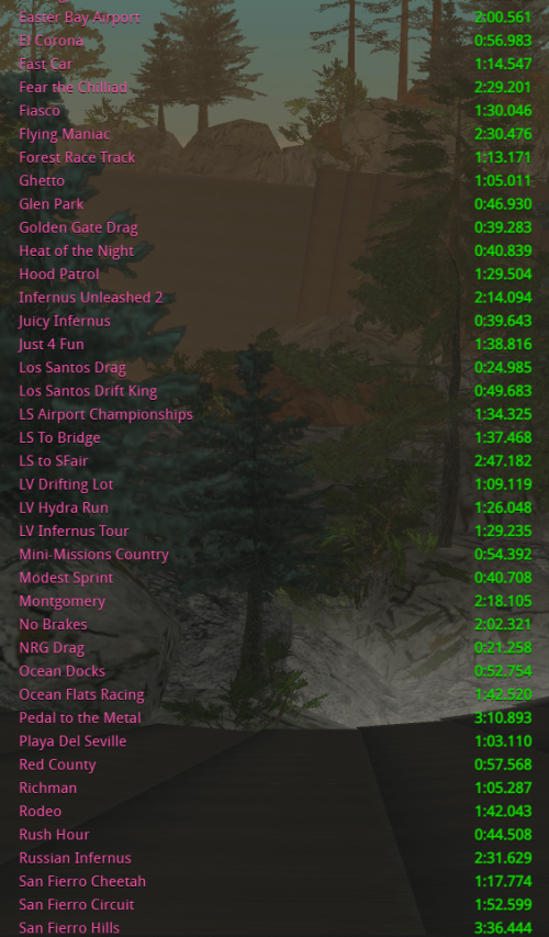
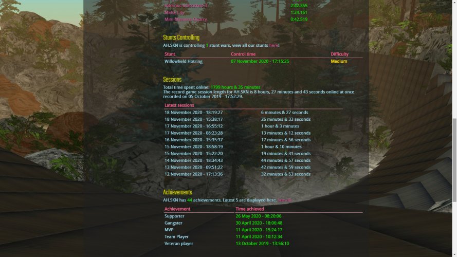
It gets even worse when we're talking about players with tonnes of race records or stunt wars:

Instead, we should limit all results (sessions, swars, race records, etc) to 5, just like achievements, building CSS or JavaScript based expansion options to reveal more results. This would help to cut down on the size of profiles considerably.
Also for the more nitty-gritty stuff, I suggest using Lighthouse -
https://developers.google.com/web/tools/lighthouse . On SFSE's site there are various performance, accessibility and SEO issues.


